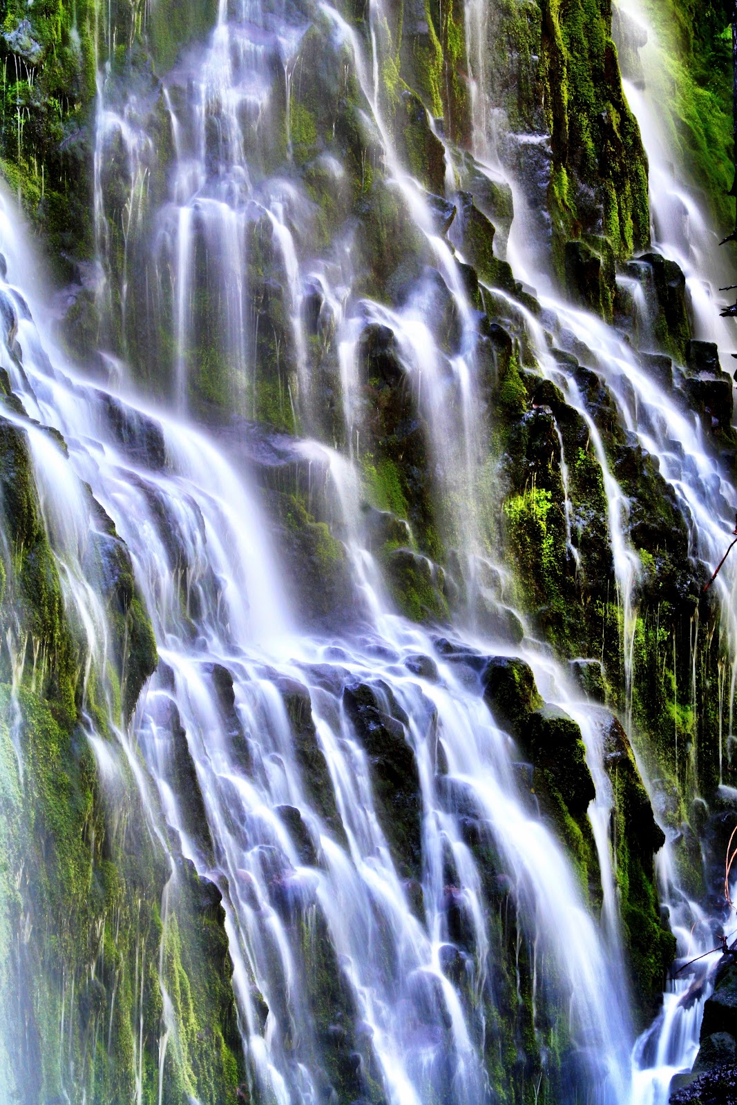
10 Composition Tips with Award-Winning Photographer Steve McCurry!www.artFido.com/popular-art
Posted by artFido - fetching art on Saturday, March 21, 2015
Composition
Assessment Three - Final
Respond to the five stems below in short answer format being certain to site your sources with both links within your text and an APA reference page. Create your response document in Google Docs and share it, enabling me to comment, through the class email, comm3530@gmail.com no later than noon, Wednesday, April 29th. No exceptions.
This assessment reflects back on class discussions during the last third of the semester. It is designed to encourage you to examine each stem carefully, define terms as they apply to photojournalism, and use the tools at your fingertips to discover information pertinent to the most correct responses.
Point Value: 100
1. While composition is a driving factor in making an impact with your image, it's also a factor of newsworthiness. Please explain.
2. This feature image of Brock below breaks a rule of leading. Please describe how it breaks the rule and why it does so.

3. I've talked about finding stories in the people I've photographed in nonverbal displays, not just within the face, but elsewhere. With the experience of shooting almost a thousand interviews as a photojournalist, what have I defined as the first of three techniques in covering an interview? Explain why this would be effective.
4. Describe the contextual impact of the illustrative image below. While there are five contexts, there is one the photographer created specifically, the one I'm looking for you to describe.


This assessment reflects back on class discussions during the last third of the semester. It is designed to encourage you to examine each stem carefully, define terms as they apply to photojournalism, and use the tools at your fingertips to discover information pertinent to the most correct responses.
Point Value: 100
1. While composition is a driving factor in making an impact with your image, it's also a factor of newsworthiness. Please explain.
2. This feature image of Brock below breaks a rule of leading. Please describe how it breaks the rule and why it does so.
Eric Young
3. I've talked about finding stories in the people I've photographed in nonverbal displays, not just within the face, but elsewhere. With the experience of shooting almost a thousand interviews as a photojournalist, what have I defined as the first of three techniques in covering an interview? Explain why this would be effective.
4. Describe the contextual impact of the illustrative image below. While there are five contexts, there is one the photographer created specifically, the one I'm looking for you to describe.
Andrea Pettersen
5. The tweets below are from Rolling Stone Editor, Will Dana. Research and discuss the ethical dilemma Rolling Stone Journalist Sabrina Erdley was trying to circumvent by not vetting her key subject's account.
.JPG)
.JPG)
.jpg)


Assignment: D-Week

This year's D-Week celebrates the D's 100th anniversary. Your assignment is to feature this celebration in illustrating what students believe is Dixie State University's identity.
Your take is due by class time, Monday, April 20th.
2015 D-Week Schedule
MONDAY, APRIL 13
8:30 a.m. to 12 p.m. - Kick Off | Diagonal/Centennial Common (FREE)
Come and get a free pancake breakfast, enjoy music, and receive a free D-Week T-shirt!
Noon - Dixie Idol Performance | Gardner Center Living Room (FREE)
6:00 p.m. to 8:00 p.m. - Food Fest | North Encampment Mall (FREE)
TUESDAY, APRIL 14
7:30 p.m. - D-Queen Pageant | Cox Auditorium ($5)
WEDNESDAY, APRIL 15
7:30 p.m. - Wednes-D Magician & Dixie Idol Finale | Garnder Ballroom (FREE)
THURSDAY, APRIL 16
6:00 p.m. - Break a World Record Event | Softball Parking Lot (FREE)
Free Ice-cream & live entertainment. Bring the whole family! Don’t forget to bring your “other school” shirts and trade it in for a brand new (FREE) Dixie Shirt.
FRIDAY, APRIL 17
5:00 p.m. - Great Race | Hansen Stadium (FREE)
Great race team packet information, click here
6:00 p.m. - Carnival | Lower Hansen Stadium (FREE)
SATURDAY, APRIL 18
8:00 a.m. - Breakfast | St. George Town Square (FREE)
9:30 a.m. - Buses begin shuttling from Town Square to the "D" on the hill (FREE)
10:15 a.m. - Centennial Photo Outlining the “D” | Up on the Black Hill (FREE)
10:30 a.m. - White Wash “D” | Up on the Black Hill (FREE)
7:00 p.m. - Evening of Dixie | Eccles Main Stage (FREE)
9:00 p.m. - 11:45 p.m. - D-Day Dance | Holland Centennial Commons Plaza (FREE)
12:00 a.m. - True Rebel | Fountain (FREE)


Shooting to Illustrate

Often shooters who are employed in-house by a news organization will be asked to create an image illustrative of an editorial - something that speaks metaphorically to an issue at hand. Not too long ago the Dixie Sun ran a story about student loan debt and the image that accompanied the story, as you might have already imagined, was that of a wallet that held a student ID, but was void of cash.
For this week's assignment, I want you to create an image that speaks to a concept or issue of your choice. The image above, for example, is a title slate for a YouTube page for The Mountain Meadows Massacre documentary. Another is the poster we talked about for the play Facing East.
Activity Description
Determine your topic or issue, design your metaphor or visual representation, and create an image that communicates your intended message. Post an account of your efforts on your blog, ending with the image you created.
This assignment is due March 30th.
Value:100 Points
Rubric
1. The shooter researched the editorial topic/issue at hand and explored a number of ways to illustrate it, journaling their efforts on their post.
Wanting (0-9) Developing (10-16) Accomplished (17-20)
2. The shooter considered design approaches including composition, lighting, depth of field and focal length, posting their approach on the blog.
Wanting (0-9) Developing (10-16) Accomplished (17-20)
3. The shooter addressed their consideration of physical, psychological, social, cultural and temporal contexts in the design of their image, writing on their post about how each is executed.
Wanting (0-9) Developing (10-16) Accomplished (17-20)
4. The shooter creates an image, illustrative of the communication objective of the design.
Wanting (0-19) Developing (20-34) Accomplished (35-40)
Last Day in the Studio
We are meeting in Studio C today to finish your portrait assignment using glamor lighting. See you there.
-e
-e
Wednesday's Lab

I'm also looking for perfection in both exposure and clarity. You all have devices that allow you this level of perfection, use them, use power and tools accordingly. I'm not seeing this, yet.
So, for Wednesday, I'm posting this assignment to get you beyond the fun of working in three-point lighting, challenging you to create work that falls into professional paradigms:
You're to complete the assignment of creating a portrait using three-point lighting to create a Rembrandt and a glamor image. You can find the rubric here.
One aspect of the rubric is to demonstrate your use of the inverse square law. Read about that here in preparation for Wednesday's lab in the studio.
The Inverse Square Law
Please read for preparation for Wednesday's lab in the studio.
(from Explore Photography)
As photographers and therefore visual artists, many people find themselves shying away from the more technical side of the discipline.
While there are large numbers of camera enthusiasts who take great pride in their knowledge of the ins and outs of every conceivable piece of photographic equipment, there are far more photographers who prefer simply to get on and take some photos. In order to become an expert in what you do, however, it is sadly necessary to have some grip on the ‘rules’ of photography.
Studio and flash lighting can be very difficult for the first-time experimenter. If you are used to shooting in natural light and making do with what is available then the new options that will open up to you in the studio may seem daunting. However, they are there to be harnessed and used for your benefit. In order to help you do this successfully, it is useful to know about the ‘inverse square law’.
It is a common misconception that moving an object twice as far from the light source will halve the available light. Instead, the inverse square law explains why light ‘falloff’ occurs so rapidly. This can be seen very dramatically with on-camera flash; if you are using a non-directional light source then you will notice that objects in the foreground of your images will be much more highly exposed than those further back. This is because the light spreads and diffuses in three dimensions, rather than simply in a straight line away from the source.

Alternatively, it is also possible to compensate on your camera. Just as the light source can be adjusted in terms of f-stops, so too can the exposure being made. Widening the aperture by two f-stops will have the same effect as increasing the power from the light source by one quarter, and should therefore give you the same exposure as would be made if your subject was half the distance away from the light.
(from Explore Photography)
As photographers and therefore visual artists, many people find themselves shying away from the more technical side of the discipline.
While there are large numbers of camera enthusiasts who take great pride in their knowledge of the ins and outs of every conceivable piece of photographic equipment, there are far more photographers who prefer simply to get on and take some photos. In order to become an expert in what you do, however, it is sadly necessary to have some grip on the ‘rules’ of photography.
Studio and flash lighting can be very difficult for the first-time experimenter. If you are used to shooting in natural light and making do with what is available then the new options that will open up to you in the studio may seem daunting. However, they are there to be harnessed and used for your benefit. In order to help you do this successfully, it is useful to know about the ‘inverse square law’.
Practicalities
The inverse square is commonplace in physics and mathematics; this article, of course, will concentrate not on the technicalities but on its practical application in photography. In very basic terms, when applied to lighting the inverse square law states that an object twice the distance from a light source will receive only a quarter of the light. Thus, if you had two objects, one of which is six feet from a light source and the other of which is twelve feet from it, the object twelve feet away will receive only a quarter of the light being received by the object six feet away.It is a common misconception that moving an object twice as far from the light source will halve the available light. Instead, the inverse square law explains why light ‘falloff’ occurs so rapidly. This can be seen very dramatically with on-camera flash; if you are using a non-directional light source then you will notice that objects in the foreground of your images will be much more highly exposed than those further back. This is because the light spreads and diffuses in three dimensions, rather than simply in a straight line away from the source.

F-stops
In the studio, the inverse square law can be very easily applied. Most studio lights have adjustable power settings, usually found on a panel on the back of the light. These settings tend to be expressed as fractions (one quarter, one half etc) which match f-stops on your camera. Thus, if you need to move your subject further back from the light source, you can increase the power of the light by adjusting the settings.Alternatively, it is also possible to compensate on your camera. Just as the light source can be adjusted in terms of f-stops, so too can the exposure being made. Widening the aperture by two f-stops will have the same effect as increasing the power from the light source by one quarter, and should therefore give you the same exposure as would be made if your subject was half the distance away from the light.
Exposing and Composing for Landscape

Despite all the celluloid and digital records I've made of Zion National Park since 1980, I’ve never had a moment where I could say that’s a keeper. I believe that is because all attempts to replicate fail on so many levels compared to Zion's contextual impact on just being there. For me there’s little point in pulling out a print to look at Watchman, the Narrows, or Angels’ Landing when the real thing is a short drive away. But that doesn’t stop me from photographing it.
I've shot 5x7, 2x2, 6x4.5, 35mm and many digital formats, leaving my work wanting until I realized that photographing Zion was not a product of my camera, it was a product of my eye and how I see into contrast.

The depth of the canyon, up to three thousand feet (over 900 meters), and its north-south orientation make exposures within the canyon that include any kind of vista or sky difficult because of the exposure range.

Cloudy mid-day skies help even contrast, diminish shadow intensity and saturate colors.

Golden-hour illumination sends light against canyon walls and depending on the season, behind canopies of foliage creating gentle highlights against dark trunks and branches. Exposure on the Virgin River in the shot of Watchman above has been compensated to pull detail in shadows.
Photographing Zion has taught me a number of approaches in landscape photography; the influence of the rule of thirds on horizons, the Gestalt principle of figure/ground relationships on depth of field, and the sway of natural vectors on composition.
The Rule of Thirds
The idea that the human eye is naturally drawn to a point that follows the suggestion of the golden mean is called The Rule of Thirds. Superimpose a tic-tac-toe grid on most aspect ratios and you might be surprised how many compositions follow this basic influence on photographic composition, visual design.
Find where the strongest and most contrasting points fall on the intersecting lines of that grid, creating movement through the frame. Rarely for me is this equilateral. The Rule of Thirds is more of a guide than a hard rule.

This shot at Alstrom Point at Lake Powell is a loose interpretation. Notice that the compositional elements of the scene's contrast are where I've defined the horizontal lines of the grid, along with the highlights at the upper left-hand intersection, and the shadows on the lower right-hand intersection.

The Rule of Thirds influence lower and upper horizontal lines away from the center of the field creating a more dynamic composition. Imagine the image below of Yosemite's Half Dome as if the horizon of the meadow were composed in the center of the frame.

Figure/Ground Relationships
Gestalt theory holds that objects within a composition are perceived as either figures - distinct elements of focus - or ground - the background or landscape on which the figures rest. Using figure ground relationships give scale and depth to landscape compositions.
The image above was made in the northern part of the Glen Canyon NAtional Recreation Area, the park that surrounds the great Lake Powell. It has a variety of geological landscapes, one of them being this barren desert. The image was composed with a mild telephoto lens to induce some compression of the dirt road and its turns, but it had little scale without the vehicle composed within it. The truck gives the composition a figure/ground relationship. Note how the placement of the vehicle is on the lower right-hand cross-section of the Rule of Thirds grid.

The yellow kayak above does the same in the relationship to the monolithic formation on the shore. This is at Warm Spring Bay at Lake Powell.
Figures do not need to be foreign to the landscape. The image below establishes a figure relationship with the background with an optical illusion. The figure is the sandstone rock formation that frames the view to the Colorado River below. The illusion is in the highlight of the sunlight that divides the large rock that is low and center in the frame giving an appearance of a continuity of the river which is remarkably 8,000 feet below.

Willis Creek Canyon on the Escalante Grand Staircase National Monument has beautiful slot canyons. This part of the canyon runs west-east, gathering sunlight on the south walls that bounce and fill the slot, making nice ambient light to naturally fill in the shadows. Positioning the film plane low just above the water with the stone just out of the focal plane depth of field creates a figure ground relationship the encourages the eye into the frame.

The image below is taken from a trail near my home in Hurricane close to the Virgin River Canyon. The figure/ground relationship is amplified in the shallow depth of field and the contrast of the yellow highlights of the blooms to the shadowed details of the foliage and texture of the ground.

The Diagonal Rule and Natural Vectors
Linear elements, such as roads, waterways, and fences placed diagonally, are generally perceived as more dynamic than horizontally placed ones.


Vectors
Indications of continuity or direction are considered to be vectors. These are categorized into graphic, motion, and index vectors, each having their purpose in composition, but in landscape photography I look for a natural graphic vector that leads the eye through the frame and when combined with the Diagonal Rule, the image results in a more dynamic composition.
Natural vectors have a strong sense of direction such as strong angles of canyon walls, the curvilinear vector of a river or divisions of geological features. These vectors encourage eye movement through the frame along the vector line, and like all compositional elements are not mutually exclusive. This can be seen in the following images created at the Toroweap lookout of the Grand Canyon.


Vertical Vectors

Horizontal Vectors


The Interview in Still and Motion
The Interview
 One of the ongoing challenges in producing documentaries is keeping the on-camera interview segments visually interesting. I like this challenge since as a photojournalist I find stories in the expressions of the people I interview, at times even more so than the supporting footage.
What I've learned after producing almost one thousand interviews is to anticipate, to illuminate, and to compose within and then outside compositional rules.

Anticipate
While this is not a photographic technique, this concepts drives what I do photographically while filming an interview and it is relatively simple: listen to what is being said and anticipate non-verbal expressions and reactions during the interview.
If the person being interviewed is telling a story, I will always start by framing them up in a standard medium shot with enough room in the frame to allow their gestures to be seen. Typically this is framed from lower torso to the top of the head with enough headroom to balance the composition.
When the person being interviewed becomes more involved or emotional within the interview I'll slowly push into the person or if the the producer is asking a question off-camera, I'll quickly bump in close and pick up my filming with the subject framed closer, typically just below the collar bone to just below the top of the head, looking something like this:


Composing Inside and Outside the Rules
I'm hoping you have noticed that this image of Brock breaks some rules of composition, how he is composed and lead in the frame. The term lead means the direction the subject is facing and the space they are facing into is called lead-room or nose-room. Were this composition framed according to these guidelines, Brock would be positioned more camera-left since his body and face is turned camera-right. For the purposes of this interview, a graphic element would come in over the white negative space on the left side of the frame, and the talent had an edge to him, an attitude that played better having him composed in this way.
What I've learned after producing almost one thousand interviews is to anticipate, to illuminate, and to compose within and then outside compositional rules.
Anticipate
While this is not a photographic technique, this concepts drives what I do photographically while filming an interview and it is relatively simple: listen to what is being said and anticipate non-verbal expressions and reactions during the interview.
If the person being interviewed is telling a story, I will always start by framing them up in a standard medium shot with enough room in the frame to allow their gestures to be seen. Typically this is framed from lower torso to the top of the head with enough headroom to balance the composition.
When the person being interviewed becomes more involved or emotional within the interview I'll slowly push into the person or if the the producer is asking a question off-camera, I'll quickly bump in close and pick up my filming with the subject framed closer, typically just below the collar bone to just below the top of the head, looking something like this:
While shooting the interview I do not lock down the head of the tripod. I maintain enough drag to keep movements from being too sudden, but loose enough to pick up any action of the subject. If my subjects looks down, for example, I'll float the frame down with them, using the focus of their eyes as a vector for the direction of my film plane movement. Should their eyes go their hands, I'll let the frame drift down to them, linger there for a moment and then crawl the frame back up to their face.
Since much of what we say is non-verbal, and much of our non-verbal expression is outside the scope of the face, I find it better story telling to pick up on these cues, anticipating where the subject's emotion or tension might be focused. Often, the hands are a great place to look.
Composing Inside and Outside the Rules
I'm hoping you have noticed that this image of Brock breaks some rules of composition, how he is composed and lead in the frame. The term lead means the direction the subject is facing and the space they are facing into is called lead-room or nose-room. Were this composition framed according to these guidelines, Brock would be positioned more camera-left since his body and face is turned camera-right. For the purposes of this interview, a graphic element would come in over the white negative space on the left side of the frame, and the talent had an edge to him, an attitude that played better having him composed in this way.


Subscribe to:
Posts (Atom)